 |
Global warming and greenhouse effect background |
|
Global warming and greenhouse effect background |
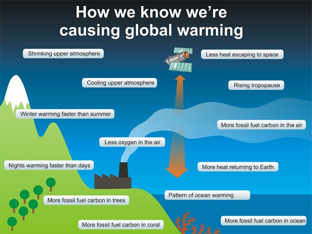
Earth’s climate is changing, and we are responsible, Figure 1. The science of climate and climate change must be incorporated into our science courses. It’s important for all citizens to understand the changes, how human activities cause them, and the responsibility each of us has to consider ways we might act to help lessen the disruption and adapt to the changing climate. This understanding starts with the students in our classrooms. During their lifetime, they will see increasingly extreme climatic changes. It’s important for them to learn about climate science and climate disruption, so they can make informed decisions about adapting to and mitigating the changes. Our biology, chemistry, earth science, and physics courses are excellent contexts for introducing this science. |
|
|
|
It’s apparent from Figure 1 that climate science is a complicated mix of many factors, but it is based on fundamental concepts from our familiar sciences. This complexity offers opportunities to integrate climate science with concepts already taught in our courses. Consider this list: phase changes, biological and geological carbon cycles, light absorption and emission, heat and temperature, heat capacity, energy conservation, food webs, energy transfer, photosynthesis, molecular structure, dipoles, stoichiometry, burping cows, acids and bases, isotopes, gas laws and properties, metabolism. If any of these are part of your courses, you are ready to bring the basic science of the greenhouse effect, greenhouse gases, ocean acidification, sea level rise, and more to your students. You can use climate science concepts as context for the topics already taught in your curriculum. Or you can use the concepts in your curriculum as context for climate science topics. It’s a win-win proposition, and it’s the rationale for the activities that make up this Workbook. |
|
| What's included | |
Most of the climate science content here is introduced and developed through Activities that include analyses of hands-on experiments, a few demonstrations, graphical real-world data, and some calculations of relevant properties of the climate system. This introduction is a brief overview of the climate system, the mechanism of global warming, and climate change to provide a setting for the individual Activities. More specific background, instructor notes, and resource references are provided with each Activity. An Activity can be included in your curriculum anywhere you find appropriate, as long as the necessary background concepts have been introduced. The Activities here are representative, not inclusive, of all climate science concepts. They are, in part, meant to inspire you to search for other connections between climate science and what you already teach. All change, including climate change, involves energy. Energy is conserved—the direction and extent of spontaneous change are determined by the redistribution or spread of energy resulting from the change. Entropy is a measure of this energy redistribution among the parts of a system and increases in spontaneous changes. Energy, entropy, and their consequences are explored in these Activities. Some Activities focus mainly on energy—different forms of energy, the energy in light (electromagnetic radiation), the effects of different sources and wavelengths of light in regulating Earth’s climate, molecular structure and the atmospheric greenhouse effect, thermal energy (atomic-molecular motion), heat capacity, rates of change, isotopes in paleoclimatology, and atmospheric stoichiometry. Entropy is introduced through an atomic-molecular level model that is gentler, more intuitive, and more visualizable than the traditional approach and designed to be more accessible than what may be in most textbooks. Entropy is used to understand the direction of change, including energy transfer, colligative properties (osmosis and phase change), solubilities, and acids and bases (especially aqueous carbon dioxide solutions, including acidifying oceans). Before going on with this introductory material, we encourage you to examine an Activity to see how it’s set up and can fit your classroom style. Here is an Activity involving energy transfer, phase change, temperature, and energy level diagrams: Energy transfer, phase change, and temperature. |
|
| Greenhouse effect background for the Activities | |
It would be ideal to introduce all the concepts needed to understand the greenhouse effect and global warming via analysis of classroom activities, but a few of these simply cannot be demonstrated at classroom scale. [See Wagoner, P., Liu, C., Tobin, R. P. “Climate change in a shoebox: Right result, wrong physics,” Am. J. Phys. 2010, 78, 637-540; and Bell, J. A., “Benchtop Global-Warming Demonstrations Do Not Exemplify the Atmospheric Greenhouse Effect, but Alternatives Are Available,” J. Chem. Educ. 2019, 96(10), 2352-2354.] Therefore, we have to introduce these concepts with words, pictures, and sometimes animations. Some of this material may be unfamiliar to many of us, so the remainder of this Introduction is designed as reminders of or introductions to the necessary ideas. We recommend scanning the remainder of this Introduction and then returning to study more deeply those topics that may be less familiar. |
|
| Earth and the Sun | |
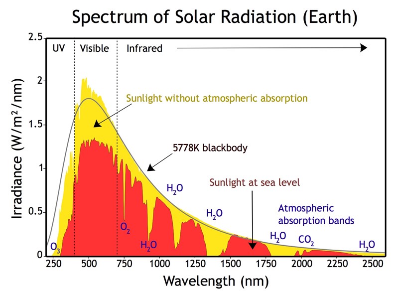
Almost all the energy that drives Earth’s climate system comes as electromagnetic radiation (light) from the Sun. (Energy from the Earth’s hot interior that reaches the surface has a negligible effect on the climate, but can be usefully harnessed for heating and power generation. Matter from the interior—gases, molten rock, and particulates—can have substantial short- and long-term effects on weather, climate, and exterior composition: Earth’s internal energy and atmospheric argon.) Light from the Sun, Figure 2, is most intense in the visible range of wavelengths, with radiation just beyond the visible in the near infrared (IR), at longer wavelengths than red light, and in the near ultraviolet (UV), at shorter wavelengths than violet light. The major atmospheric gases, nitrogen, oxygen, and argon, do not absorb this radiation from the Sun. The atmospheric molecules do, however, refract and scatter the incoming light, so less light reaches the surface (the red area in the figure) than enters at the top of the atmosphere (the sum of the yellow and red areas). More scattered blue light than red reaches the surface, so the sky looks blue. |
|
|
|
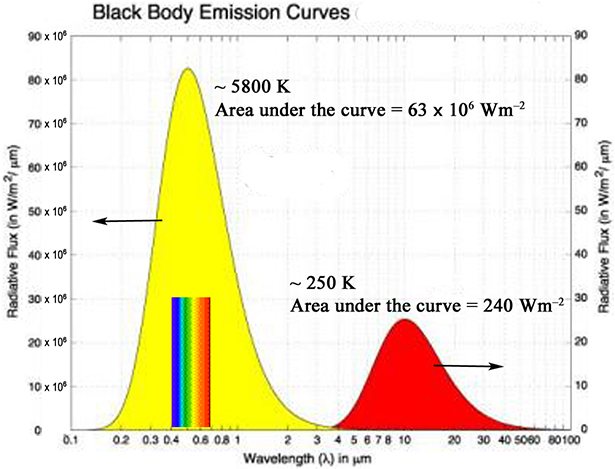
Although atmospheric gases do not absorb visible wavelengths of light, many absorb energy in the ultraviolet and infrared, as shown in Figure 2. The ozone layer in the stratosphere protects living things on the surface from harmful ultraviolet radiation because ozone, O3, absorbs these wavelengths. The major absorber of incoming solar radiation in the troposphere (lowest layer of the atmosphere) is water vapor (humidity) that absorbs extensively in the infrared. The incoming solar radiation that reaches the surface is either absorbed and warms the surface or is reflected back into space by surfaces like snow and ice. About 70% of the solar radiation that enters the top of the atmosphere is absorbed to warm the atmosphere and surface (and drive chemical reactions like photosynthesis). Like all warm objects (temperatures above zero kelvin), the warm Earth surface emits electromagnetic radiation called “blackbody” radiation. The wavelengths of light emitted by warm objects (“blackbodies”) depend on their temperature—the hotter the object, the shorter the wavelengths of light it emits. The Sun, with a surface temperature of about 5800 K, emits light that is most intense at visible wavelengths around 500 nm. The solid black curve in Figure 2 shows the wavelength distribution of a blackbody at 5778 K. The Earth, with an average surface temperature of about 288 K, emits infrared light at wavelengths that peak around 16.000 nm |
|
|
|
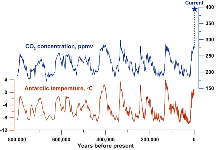
The average temperature of the Earth is determined and maintained by the balance between the energy of the incoming solar radiation at the top of the atmosphere and the energy of the outgoing radiation leaving the top of the atmosphere. The outgoing radiation is solar radiation scattered by the atmosphere or reflected at the surface, together with the emitted infrared radiation that reaches the top of the atmosphere. The major atmospheric gases do not absorb infrared light emitted from the Earth’s surface. Infrared radiation is, however, absorbed by water vapor (humidity) and minor atmospheric gases like carbon dioxide, methane, nitrous oxide, ozone, and a myriad of synthetic halogenated compounds (used mainly by humans as solvents and refrigerants). This absorption by some atmospheric gases interrupts the flow of the infrared energy from the Earth’s surface to the top of the atmosphere, so less energy leaves than if these gases were not present. To compensate for the interrupted flow and maintain a balance between the incoming and outgoing energy, more infrared energy has to be emitted at the surface than if these gases were not present. To emit more energy, the surface has to get warmer, so the presence of the infrared-absorbing gases means a warmer planet: Fate of Earth’s energy imbalance. This planetary warming effect is sort of like the warming effect of a glass greenhouse, so the infrared-absorbing gases are called “greenhouse gases”. The name “greenhouse gas” is unfortunate and misleading. The warming effect in a glass greenhouse is a result of convection of the air trapped in the enclosure and warmed by contact with interior surfaces that have absorbed solar energy. The warming has nothing to do with infrared radiation. Planetary warming caused by greenhouse gases has everything to do with infrared radiation and little to do with convection. We need to understand what makes gases greenhouse gases and how they cause planetary warming, the greenhouse effect. But before going on, let’s be clear that the planetary temperature control we are discussing is a natural process. Earlier in the planet’s 4.5-billion-year history, variations in the amount of energy from the sun, huge geological changes (including movement of tectonic plates, enormous volcanism, and formation and decay of mountains), and collisions with asteroids caused large changes in the temperature and climate. But, for at least the last few million years, the process we will describe has kept the Earth suitable for life as we know it and allowed our evolutionary ancestors to inhabit the planet. Our best record of the most recent part of this period is from ice cores drilled out of the Antarctic ice sheet, Figure 4, that extends back 800,000 years. The CO2 data are from atmospheric gases trapped in bubbles in the ice cores. The temperature data are from analyses of the isotopic composition of the ice entrapping the bubbles. |
|
|
|
These temperature data characterize conditions near Antarctica. The corresponding global temperature variations are only about 5 °C, with average planetary temperatures ranging from about 10 °C at the coldest to about 15 °C at the warmest. The past few million years has been a relatively cold period in Earth’s history, with lots of northern hemisphere glaciation and ice sheets interspersed by relatively brief interglacial warmer periods (as at present) about every 100,000 years. The corresponding peaks and valleys in the CO2 concentration are remarkably consistent, varying from about 180 ppmv to about 280 ppmv. The important thing to note about these temperature and CO2 changes is that they were slow, requiring tens of thousands of years to complete. This was plenty of time for animals and plants to adapt to the changes, for example, by moving to a different geographical region. The evolutionary line (Homo sapiens) leading to present-day humans arose about 300,000 years ago, with modern humans appearing about 70,000 years ago. Until about 12,000 years ago, our ancestors were hunter-gatherers, dependent on finding their sustenance in nature. As the Earth emerged from its last ice age (Figure 4), they developed agriculture and began to produce their own food. Some were freed from searching for food to provide other goods and services and soon societies, towns, and cities were born. Thus, human activities have been altering the face of the planet for about 120 centuries, but the changes were relatively small and generally localized. Things changed dramatically about two-and-a-half centuries ago when the Scottish scientist, James Watt, invented a practical steam engine. This source of power could be located anywhere (and even be mounted on wheels—a locomotive—to move goods around) and initiated the Industrial Revolution. The incredible array of things that are available to many and desired by many others in the modern world is a result of this revolution. Unfortunately, to create the steam for steam engines and the explosions in internal combustion engines, we have burned and continue to burn fossil fuels—coal, oil, and gas. So, in addition to the things we want, we also create vast amounts of carbon dioxide, about half of which remains in our atmosphere and affects the entire planet. The star at the far right of the CO2 plot in Figure 4 calls attention to its concentration, 392 ppmv in 2012, when the graph was made. The concentration now, in 2021, is over 414 ppmv. The extra CO2 has been added to the atmosphere in just the past two centuries. Thus, humans have added over 130 ppmv of CO2 in two centuries, compared to the 100 ppmv changes that occurred naturally over hundreds of centuries for at least the past 800,000 years and probably much longer. The speed and magnitude of this change have thrown the climate system out of whack, and the concentration of CO2 continues to grow. The activities in this Workbook will explore some of the consequences of higher levels of CO2, but first we need to discuss the properties of greenhouse gases and how they control the planetary energy balance (and, thus, its temperature). |
|
| What makes a gas a greenhouse gas? | |
| The fundamental property of a greenhouse gas is that it absorbs infrared radiation energy. It turns out that the energies required to increase the vibrational motions of molecules are in the range of infrared light energy. In order for infrared electromagnetic radiation to interact with a vibrational motion of a molecule, the vibration has to change the dipole moment of the molecule, that is, the distribution of charge within the molecule. (This allows the electric fields of the light wave and molecule to interact with one another—sort of like radio waves interacting with a tuned antenna.) All molecules with three or more atoms (as well as heteronuclear diatomics, NO or CO, for example) absorb some wavelengths of infrared light. An example can help clarify the concept of changing dipole moments. | |
|
|
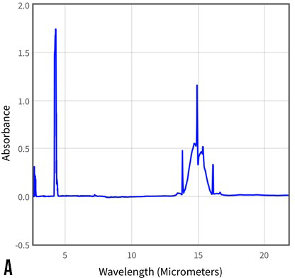
Although the molecule has no permanent dipole moment, some of its vibrational motions produce a dipole moment. This change from zero dipole moment to a nonzero value means that such a vibration can absorb infrared radiation. The symmetric stretch (top) does not change the balance between the bond dipoles; this vibration does not absorb infrared radiation. Bending out of the line (middle two) or asymmetric stretch (bottom) does change the charge balance. These vibrations absorb infrared in bands centered at about 15.0 μm (bends) and 4.3 μm (stretch). Figure 5A is the infrared absorption spectrum of CO2. Comparison with Figure 3 shows that the 15.0 μm bending absorption is close to the wavelength of maximum blackbody emission from the Earth. This means that CO2 will interact strongly with that emission. (The stretching absorption at 4.3 μm falls very nearly outside the range of wavelengths emitted by the Earth and interacts only weakly.) |
|
|
|
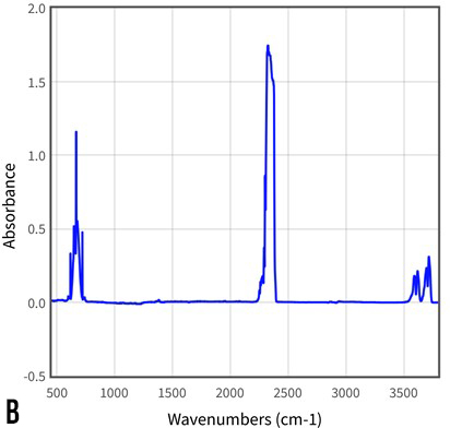
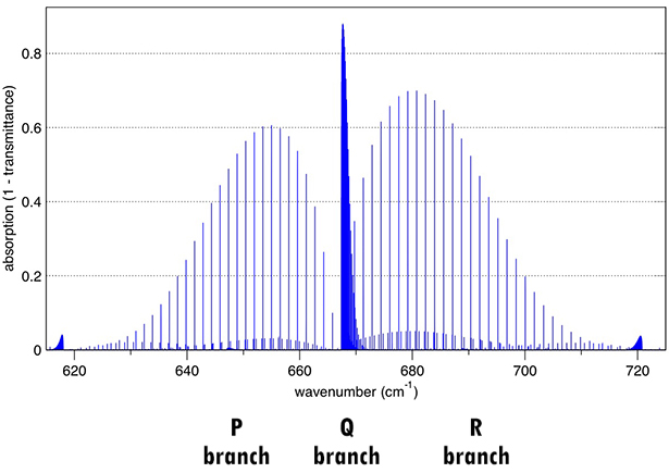
The same absorbance data are shown in both Figure 5 plots, but with different horizontal-axis scales. Plot A uses the familiar wavelength scale, usually given in units of nanometers, nm (1 nm = 10–9 m) or micrometers, μm (1 μm = 1000 nm), as in Figures 2 and 3, respectively. Spectroscopists often use a wavenumber scale, units of cm–1, which is the number of wavelengths that fit in a one-centimeter length. Since there are 10,000 micrometers in one centimeter, the conversion from μm to cm–1 is Although we say the CO2 bending vibrations absorb at 15.0 μm (667 cm–1), Figure 5A shows a complicated absorption spanning the range from at least 13-17 μm. A prominent, sharp spike in absorbance at 15.0 μm is flanked by two broad, lower-absorbance “wings” (and smaller spikes, often called “hot bands”). The explanation for most of this structure is that CO2 molecules rotate as well as vibrate. The rotation causes the oxygen atoms to move a bit farther from the central carbon atom. Slightly more energy is required to get a longer rotating molecule to vibrate (bend) and the amount of extra energy depends on how much rotational energy the molecule has. Figure 6 is a calculated infrared absorption spectrum of the 15.0 μm (667 cm–1) band in a low-pressure sample of CO2 where there are few interactions among the molecules. |
|
|
|
As in Figure 5, there is an intense spike at 667 cm–1 (the Q branch). The “wings” (lower energy P and higher energy R branches) are resolved into a series of sharp absorptions instead of being unresolved broad bands. The quantum mechanical explanation for the discrete energies of the vibration-rotation absorptions is not relevant for our discussion, but it is useful to keep in mind the underlying structure of the “wings”. The shapes of the P and R band envelopes reflect mostly the Maxwell-Boltzmann population distribution of the rotational energy levels. In higher pressure samples, perturbations by collisions with other molecules cause these sharp energy transitions to broaden and coalesce into the continuous energy “wings” observed in Figure 5. The pressure of the sample in Figure 6 is comparable to the small amount of carbon dioxide near the Earth’s surface in our present atmosphere. Note that more than 80% of the energy at the peak of the Q band is absorbed on passing through 10 centimeters of the gas. The message here is that essentially all the energy emitted by the Earth in this narrow energy region (about 667 ± 50 cm–1) is absorbed by atmospheric carbon dioxide within the first several meters of the surface. Figures 5 and 6 show that CO2 absorbs certain wavelengths of infrared light, but, for teaching purposes, a more direct demonstration of its effect on the radiation from a black body (warm surface) is desirable. A simple experiment (that could also be a demonstration) to show that carbon dioxide absorbs infrared radiation has been described: Bruce, M. R. M., Wilson, T. A., Bruce, A. E., Bessey, S. M., and Flood, V. J., “A Simple, Student-Built Spectrometer To Explore Infrared Radiation and Greenhouse Gases”, J. Chem. Educ. 2016, 93, 1908-1915. The infrared source (“black body”) is a standard laboratory hot plate turned on its side and the detector is an inexpensive infrared thermometer. Clear, colorless plastic bags are used to contain samples of N2 (or air) and CO2 that can be placed between the source and the detector. Less infrared radiation reaches the detector when the carbon dioxide is in the path, so a lower temperature is observed. The effect is modest. This is a reminder and reinforces the fact that only relatively narrow bands of infrared wavelengths are absorbed. |
|
| Structure and properties of the atmosphere | |
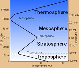
Most of us are not really familiar with infrared radiation, which we can feel (as the warmth from a nearby warm object), but cannot see. Thus, its fate can seem a bit mysterious, as it interacts with greenhouse gas molecules in the atmosphere. The atmosphere’s structure and composition are important in determining these interactions. The atmosphere has a layered structure, Figure 7, with the layers characterized by their temperature profiles (temperature as a function of altitude—distance from the surface). The layer nearest the surface, the troposphere (Greek tropos = change), gets cooler and less dense as altitude increases. (That’s why it’s cooler at the top of a mountain than at its base.) The rate of change of temperature with altitude is called the “lapse rate”. The lapse rate varies and is affected by humidity, convection, day/night, season, and so forth, but a pretty good average over common conditions is –6.5 K/km. For example, if the surface temperature is about 288 K (15 °C), atmospheric temperature at 10 km altitude (about 6 miles) is about |
|
|
|
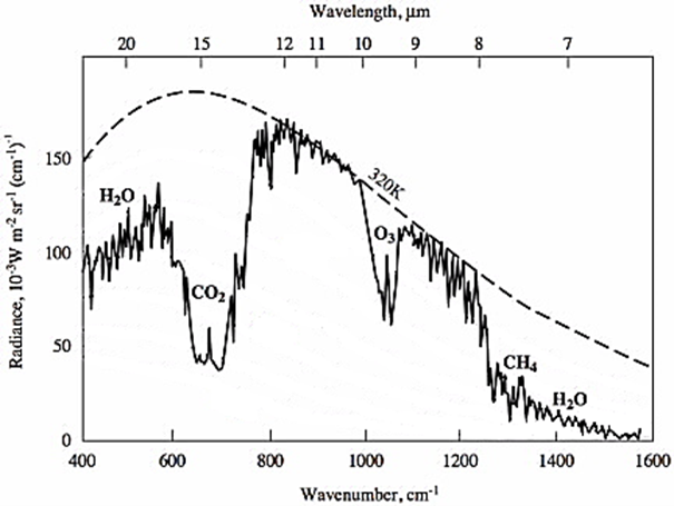
At an altitude about 10-15 km, the atmospheric temperature stops falling and does not change much for the next several kilometers. This fairly constant temperature layer, called the tropopause, separates the troposphere from the stratosphere (from Latin strato = layer) where the temperature increases with altitude. The increasing temperature is a result of the absorption of solar energy, ultraviolet wavelengths, by oxygen and ozone, Figure 2, and their reactions at these altitudes. The tropopause occurs as the decreasing tropospheric and increasing stratospheric temperatures interact to sort of cancel one another. The tropopause begins at higher altitudes near the equator and lower altitudes near the poles; around 11-12 km is a reasonable average. The higher atmospheric layers, mesosphere and thermosphere, Figure 7, which contain less than 0.1 % of the atmosphere, are not relevant for this discussion of climate change. The composition of dry air (atmosphere with no water vapor) is approximately 78 % N2, 21 % O2, and 0.9 % Ar. The remaining less than 0.1 % is a mixture of trace gases, the most abundant of which is CO2, now at a little over 0.041 %. The rest of these trace gases are also greenhouse gases. In an actual humid atmosphere, water vapor is usually the most important contributor to the greenhouse effect. We said above that less energy leaves the top of the atmosphere than if these gases were not present. Satellite observations, Figure 8, show the experimental evidence for this statement. |
|
|
|
The dashed curve in Figure 8 is the calculated emission for a black body surface at 320 K. The vegetation in the Niger valley emits very much like a black body, so its midday emission is pretty well represented by the dashed curve. This is the energy leaving the surface, but the satellite measures only the energy leaving the top of the atmosphere, the solid curve. Various greenhouse gases prevent some of the Earth’s total emission from leaving the atmosphere. This energy warms the earth above the temperature it would have without an atmospheric greenhouse effect. That is, the greenhouse effect keeps the temperature suitable for life as we know it. |
|
| Greenhouse effect mechanism | |
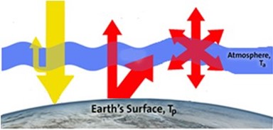
But what is the mechanism for this phenomenon? How do the properties of the atmosphere and greenhouse gases bring about the observations in Figure 8? A simple schematic diagram, Figure 9, can help us understand the main ideas. The yellow arrows on the left represent light from the Sun, some of which reaches and warms the surface and some that is reflected away. The red arrows in the center represent the infrared light emitted by the warmed surface. Some of these wavelengths pass unabsorbed through the atmosphere and others are absorbed by atmospheric greenhouse gases. The red arrows on the right represent emission from the greenhouse gases in this atmospheric layer. This emission is in all directions, some heading toward space and the rest back toward the surface. |
|
|
|
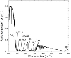
To model the actual atmosphere, it must be divided into many layers, from the surface up through the troposphere (and into the stratosphere, as necessary). Infrared light entering each layer from below comes from both the surface and emissions from the layers below. Again, some wavelengths of this light pass through the layer unabsorbed, but its greenhouse gases can absorb other wavelengths. The temperatures of the layers, determined by the factors responsible for the lapse rate, decrease with altitude. The pressures in the layers and, hence, the numbers of molecules, also decrease with altitude. Thus, there are fewer greenhouse gas molecules to absorb infrared radiation energy the farther a layer is from the surface. There are regions of the infrared where none of the greenhouse gases absorb energy. In these regions, the radiation passes directly from the surface to space (represented in Figure 9 by the central red arrow that passes though the atmosphere). Figure 8 shows that the 800-950 cm–1 region is one of these “windows” where infrared radiation from the Earth’s surface shines unimpeded into space. The fate of the surface emission in the infrared regions where greenhouse gas absorption occurs is the basis of the greenhouse effect. The physics of the transfer of infrared radiation energy from a planet’s surface to the top of its atmosphere through greenhouse gases is well understood, but unfamiliar to most of us, so can be tricky to understand. We’ll try an idealized, qualitative approach. All greenhouse gases behave essentially the same way in radiation transfer. We’ll use CO2 as our example, since it is the focus of so much attention in climate change. CO2 absorbs strongly in the 630-715 cm–1 region. At the concentration in Earth’s atmosphere, all of the radiation at 667 cm–1 is absorbed in about a two-meter length of sample. Within a few tens of meters from the surface, essentially all the infrared radiation in the 630-715 cm–1 region will be absorbed by atmospheric CO2. Where does the radiation come from that leaves the top of the atmosphere in this wavenumber region, Figure 8? When a CO2 molecule absorbs a photon of infrared energy, the molecule vibrates more energetically than before the absorption. The molecule could lose its extra energy by re-emitting the energy, but for CO2, this process takes many microseconds. During such a long time, the molecule can undergo millions of collisions with surrounding molecules and transfers its extra energy to them, which increases their motion and would have the effect of slightly raising the temperature of the gas in the layer. But these events occur in and disturb the vast bath of surrounding layer molecules that are at thermal equilibrium (a Maxwell-Boltzmann distribution of energy among the molecules). To maintain the equilibrium, an equivalent amount of energy is emitted by one of the more energetic greenhouse molecules in the layer. This has the effect of keeping the energy in the layer constant. Absorption and emission of infrared radiation by the greenhouse gas in a layer are balanced. However, emissions from a layer are in all directions, only some of which are headed toward space. Thus, the number of photons leaving a layer and heading toward space is fewer than the number that enter from below heading outward. Each layer attenuates (reduces) the number of photons heading outward, so, ultimately, fewer leave the top of the atmosphere than were emitted from the surface. Note that, in wavelength regions with greenhouse gas absorption, the photons that leave the top of the atmosphere are not the ones emitted at the surface, but come from the gases in the atmosphere. Since the emission from the greenhouse molecules in the atmosphere is in all directions, some of it must reach the surface. That is, the atmosphere radiates back toward and warms the surface. Practical problems make it difficult to measure this radiation, but Figure 10 shows that it can be done. The spectrum has to be taken on a dark night (no sunshine or moonshine) when it is very cold (to reduce the extensive emission from water vapor as much as possible). Note that there is almost no emission in the “window” region, 800-950 cm–1, where Figure 8 showed that the emission from the ground went directly into space. However, in the 26 years (1970 to 1996) between the observations in Figures 8 and 10, the concentration of chlorofluorocarbons, CFCs, had accumulated and their emission from the atmosphere appears in Figure 10. Indeed, part of the reason for the investigation that produced the figure was to determine how much these compounds were adding to the human-caused greenhouse gas burden of the atmosphere. |
|
|
|
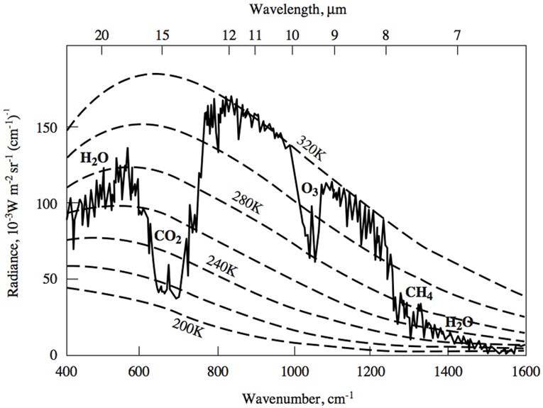
Since greenhouse gases are emitting infrared radiation into space (and toward the surface), from what layer or layers of the troposphere are the emissions coming? Recall that the number of molecules in the layers decreases with altitude (pressure is lower at higher altitude). Thus, the absorbing power of a greenhouse gas decreases with altitude, because there are fewer molecules to do the absorbing. At some altitude, the absorption for any particular wavelength will become so weak that the radiation will simply pass through that layer (and all those above) and out to space. Figure 6 shows that CO2 absorption is weakest toward the edges of its absorption band wavelengths. The absorptivity of CO2 in a layer at a relatively low altitude will be too weak to absorb these wavelengths. Photons of these wavelengths will pass directly through the rest of the atmosphere to space. For photons of wavelengths with higher absorptivities, the trip to space begins from higher altitude layers. Since altitude and temperature are related, via the lapse rate, we can get a good idea where the photons come from by considering the temperature of the layers. A way to do this is illustrated in Figure 11. In addition to a black body curve representing the surface emission, further black body curves for decreasing temperatures (higher altitudes) are superimposed on the experimentally measured top of atmosphere emission from Figure 8. |
|
|
|
There is a more fundamental reason for including the black body curves with the experimental data. Although the atmosphere does not emit as a black body (emission is not at all wavelengths, as is obvious from Figure 10), the layers are each in thermal equilibrium. Emissivity (and absorptivity) from molecular vibrations in them is proportional to that of a black body at the layer temperature. Thus, when we see greenhouse gas emission at a particular wavelength, it is from layers at a temperature where the absorptivity and emissivity have fallen low enough to let all the photons pass through on their way to space. For example, the lowest amount of energy emission from the CO2 region, about 650-700 cm–1, is from layers at temperatures near 220 K. As we saw above, this is the temperature at the top of the troposphere, so these photons are probably from layers at the beginning of the tropopause. The photons from ozone, O3, seem to come from layers much closer to the surface, temperatures above about 280 K. Most tropospheric O3 is formed by photochemical reactions near the surface and reacts relatively rapidly with other species before it can diffuse much higher in the atmosphere. Thus, there are few O3 molecules to absorb and emit in higher layers and these photons from near the surface pass without hindrance through the rest of the troposphere. There is a great deal of water vapor emission at both the lower and higher wavenumber regions of the top of atmosphere emissions in Figures 8 and 11. This reflects the fact that water vapor is generally the most abundant greenhouse gas (100 times more than CO2 in many cases) and is a powerful infrared absorber. Most of the emitted photons that reach the top of the atmosphere seem to come from layers at about 260 K, which means that higher layers (lower temperatures) offer no impediment to the passage of these photons. This is because water vapor condenses out as liquid and solid, as temperatures fall below 273 K. There is very little water vapor in the upper layers of the troposphere. You have probably noticed the small spike of brighter emission (more energy) in the middle of the emission bands from CO2. Comparison with the CO2 spectrum in Figure 6 shows that this spike is at the wavelength of the intense Q-band absorption. Since this absorption is so much stronger than the P- and R-bands responsible for the absorptions and emissions that flank the spike, it is surely the case that this wavelength should continue the absorption and emission from higher layers, if those layers contain CO2. Since most of the emission from CO2 comes from the top of the troposphere (or perhaps a bit into the tropopause), the layers above are in the tropopause and the stratosphere. There is no reason why CO2 should not diffuse upward into the stratosphere and, indeed, there is CO2 in further decreasing amounts as altitude increases. Finally, a layer of the stratosphere will be reached where there is not enough CO2 to absorb Q-band wavelength photons and they will be emitted to space. However, the temperature of the stratospheric layers increases with altitude, Figure 7, so these photons will carry the signature of a warmer layer than the top of the troposphere. This is why the bright spike shows up as having a warmer origin. Note that the O3 emission also has a brighter emission spike in the middle of the emission bands. The reason is that O3 has no Q-branch absorption, so there is a narrow wavelength region between its P- and R-branches where the absorption is low. Thus, photons of these wavelengths escape at lower altitude, so there are more of them. As a result of the previous discussion, we should be able to determine the effect of adding more CO2 to the atmosphere. The experimental observation shown in Figures 8 and 11 was taken in 1970 when the atmospheric CO2 concentration was about 325 ppmv. The present (2021) value about 414 ppmv. At this higher CO2 concentration, photons emitted to space from these molecules will have to come from higher (cooler) layers of the atmosphere, that is, layers with lower pressure (fewer molecules). To a reasonable approximation, all the emissions in the region from about 600-750 cm–1 will come from lower temperature layers. Their emissions will be decreased, making the CO2 emission band in the figures somewhat deeper and fatter. If nothing else changes, the total emission at the top of the atmosphere would be decreased. More energy from the Sun would be coming in than energy leaving, upsetting Earth’s energy balance. To compensate, the surface of the Earth gets warmer, so more black body energy is emitted. When it becomes warm enough, the steady state of energy-in-equal-energy-out is re-established at the new higher surface temperature. This takes time to occur and, as humans continue to add greenhouse gases to the atmosphere, the new, higher steady-state temperature has not yet been reached. It’s important to understand the basics of the radiative transfer mechanism, as a foundation for teaching about the greenhouse effect, global warming, and climate disruption. However, it’s surely counterproductive to try to explain it to all audiences, so analogies that are as “visual” as possible are necessary. (Care has to be taken with analogies, because they are all “wrong” in fundamental ways or they would be the real thing.) The simplest analogy is to consider the greenhouse gases like a blanket. When you lie under a blanket, energy created by your metabolism (like the energy from the Sun on the planet) gets transferred from your skin to the blanket. The low conductivity of the blanket inhibits the energy from being transferred too rapidly out to the surroundings. Thus, you feel warmer than you would if there were no blanket. Now, if we add another blanket (increase in greenhouse gases), you may begin to feel uncomfortably warm, just like the Earth is experiencing. (The fundamental problem with this analogy is that it has essentially nothing to do with infrared radiation. Both a blanket and an atmosphere slow the process of energy loss: the effect of the blanket is to slow conduction of energy from your skin to the air, while the atmosphere limits the energy radiating from the Earth’s surface to outer space.) For an audience that is comfortable with an argument based on rates, one can invoke a layered atmosphere where each layer attenuates somewhat (mechanism unspecified) the flow of energy (photons) passing from the surface to the top of the atmosphere. It makes sense that the amount of attenuation should be a function of the amount of greenhouse gas, so the rate of flow of energy will be slower with a higher concentration of the gas. If the energy from the surface is constant (energy absorbed from the Sun), then slowing the rate at which energy is lost will have the effect of backing it up (thus increasing the temperature at the surface). This analogy can be demonstrated visually, if we assume that the attenuation effect reaches a steady state to keep the energy out equal to the energy in over a long time. (See Bell, D.A. and Marcum, J.C., “Adapting Three Classic Demonstrations to Teach Radiant Energy Trapping and Transfer As Related to the Greenhouse Effect”, J. Chem. Educ. 2018, 95, 611−614; in particular, Figure 3 and its explanation.) The demonstration involves water flowing through a series of compartments connected by tiny openings and observation of a steady state of water levels in the compartments. Increasing the number of compartments (analogous to increasing the concentration of carbon dioxide in the atmosphere) without changing the inflow rate (analogous to constant solar energy input) changes the steady state. In particular, the water level increases in the first compartment (analogous to energy at the surface of the planet). |
|
| What's next? | |
As you consider and incorporate Activities from this Workbook into your classroom, the background information in this Introduction can be useful as a context for the concepts the Activities are meant to exemplify. Occasionally, a reference back to this Introduction will be included as a reminder where to find some useful background not repeated in the Activity. When you use an Activity from the Workbook, feel free to add such explanatory material for your students. |
|
 |
|
To obtain a Word file of this introduction, please fill out this brief form to help us track what is happening to our Workbook. We also encourage you to get in touch if you have an activity or idea for an activity that might add to the Workbook. We want to make this an alive and active document. |
|
 |
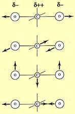 Consider the important greenhouse gas, CO2. Its molecular vibrational motions are represented in this graphic. The molecule is linear, with the oxygen atoms symmetrically located on either side of the central carbon. Because oxygen atoms are more electronegative than carbon, the electron density in the bonding electrons is drawn toward the oxygen ends of the molecule, giving them a partial negative charge. This leaves the carbon somewhat electron deficient with a partial positive charge. The result is two identical opposing bond dipoles, which cancel out to give the molecule a net zero dipole moment. That is why CO2 is usually characterized as “nonpolar”.